
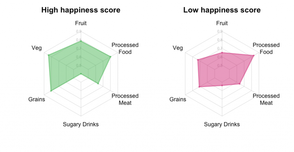
It’s said that you are what you eat, so we looked at what our happiest and unhappiest users are eating.
The graphs above show those in the Evergreen community with a high happiness score do tend to have a healthier diet. For example, they eat more fruit and veg and don’t tend to drink many sugary drinks. Both groups eat around the same amount of processed food.†
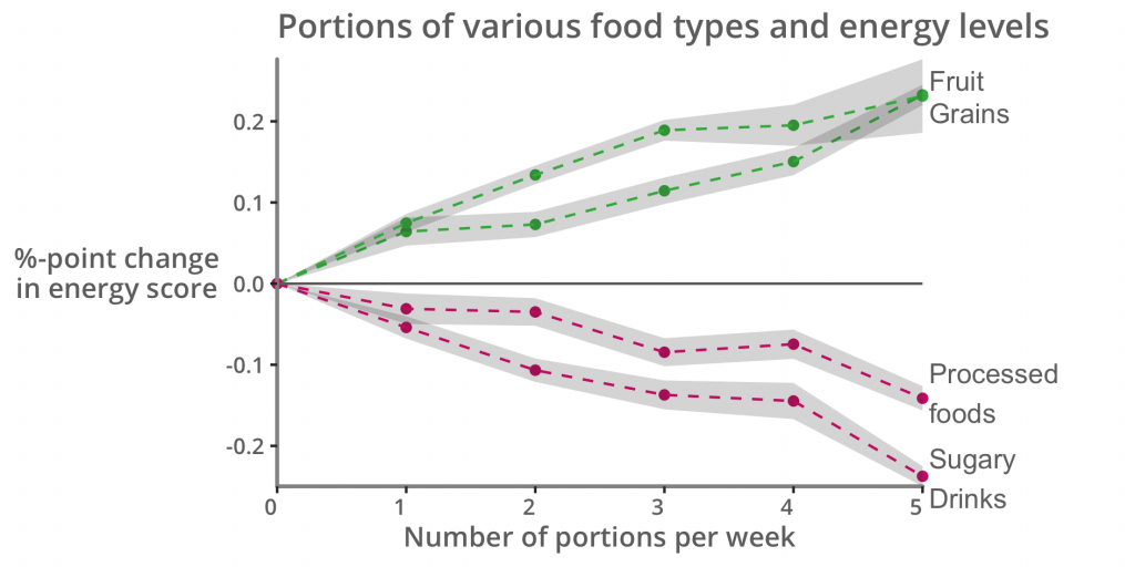
Food doesn’t just taste good, it’s also our fuel. So what foods are linked with better energy levels?
The green line in the graph above shows the more fruit and grain portions our users eat, the higher their energy levels. Conversely those who eat processed food and sugary drinks generally tend to have lower energy levels.‡
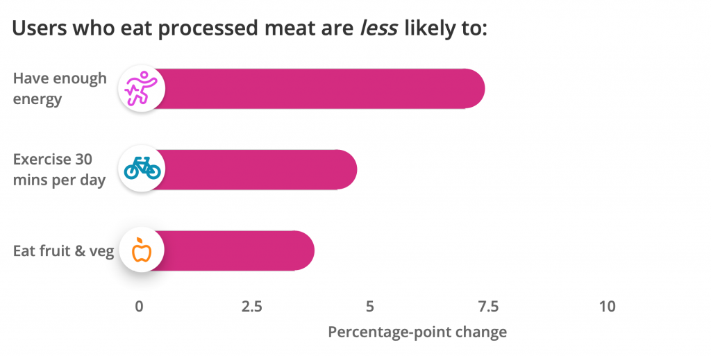
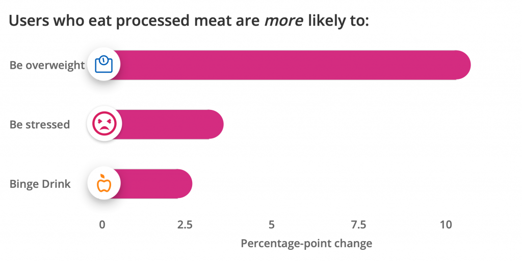
Now we’ve seen a link between processed food and lower energy, let’s explore what factors might be linked specifically to processed meat.
The graph above shows how eating processed meat is linked to a variety of factors. For example, users in our community who eat processed meat are less likely to eat fruit and veg and are more likely to be overweight.§
If you want to make any changes, our What’s in a healthy diet article outlines the key components for better eating.
Statistical Disclaimers:
Definitions:
“Healthy diet” is defined by users reporting that they consume: two or more portions of fruit OR two or more portions of veg OR two or more portions of fish/seafood OR two or more portions of healthy grains; OR at least one portion of oily fish.
“Sources of fibre in their diet” is defined by users reporting that they consume: two or more portions of fruit OR two or more portions of veg OR two or more portions of healthy grains.
Correlation ≠ Causality:
All statistical associations mentioned on this page represent statistically significant (95% level) correlations only. We do not make any claim of causality running in either direction between any two variables discussed, and have controlled for variation in age, sex and the Index of Multiple Deprivation (IMD) decile only.
Radar/Spider graph:
This graph uses data from over 20,000 Evergreen Users who have both answered a question about happiness and all of the diet-related questions displayed. The displayed percentages are for users who say they consume at least one portion of each item, respectively. The happiness stratification is based on users who scored 4 or below (low) and 7 or more (high) on the 10 point happiness scale.
Portion Graph:
The displayed correlations are the coefficients from 4 linear probability models of energy, one for each food item, which also control for age, sex, and IMD decile. The energy outcome variable takes a value of 1 if a user reports “often” or “always” “having enough energy to do the things they do”, zero otherwise. Portions is included in the regressions as a categorical variable ranging from 0-4, and 5 or more. The base category is 0 portions. All coefficients are statistically significant at the 95% confidence level (testing for differences between each portion category and 0 portions).
Correlates graph:
The displayed correlations are the coefficients from 6 linear probability models, one for each outcome on the left, which control for processed meat consumption, age, sex, and IMD decile. Processed meat consumption is defined as “any” versus “none”.