Visual elements
Logos
The logo
Use the full colour logo wherever possible

The mark
Should be used when an icon or avatar is required. Use the full logo in all other cases

Clear space
The logo must always be surround by clear space. The minimum spacing is equivalent to the height of the heart on all 4 sides.

Colours
Primary colours
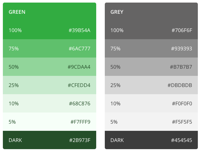
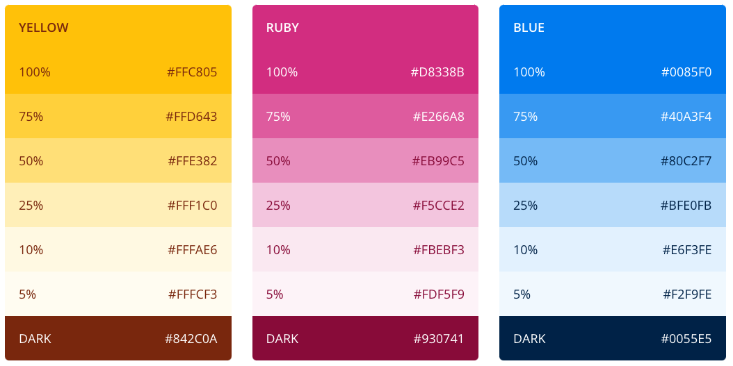
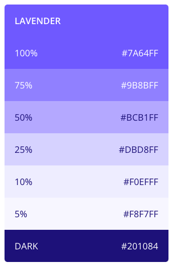
Complimentary colours
Typography
Evergreen Life uses two typefaces, Co Headline for headings, and Open Sans. The typeface is used at various weights, primarily Regular (400) and Semibold (600). To ensure optimum legibility, it’s best to avoid Light (300) or lighter weights.

Headings
Co Headline is used for H1 – H3, Open Sans is used thereafter. All headings have a letter spacing of .35px, and a line height of 140%.
People powered health.

People powered health.

People powered health.

People powered health.

People powered health.

Content
Paragraphs are all set in Open Sans regular (400).
Bring all your health information and GP records together in one place. Book GP appointments, order NHS prescriptions and get insights on how to be as happy and healthy as possible with the Evergreen Life app.

Bring all your health information and GP records together in one place. Book GP appointments, order NHS prescriptions and get insights on how to be as happy and healthy as possible with the Evergreen Life app.

Bring all your health information and GP records together in one place. Book GP appointments, order NHS prescriptions and get insights on how to be as happy and healthy as possible with the Evergreen Life app.

BRING ALL YOUR HEALTH INFORMATION AND GP RECORDS TOGETHER IN ONE PLACE.

Lists
Unordered lists
- Lorem ipsum dolor sit amet, consectetur adipiscing elit.
- Lorem ipsum dolor sit amet, consectetur adipiscing elit.
- Lorem ipsum dolor sit amet, consectetur adipiscing elit.
Ordered lists
- Lorem ipsum dolor sit amet, consectetur adipiscing elit.
- Lorem ipsum dolor sit amet, consectetur adipiscing elit.
- Lorem ipsum dolor sit amet, consectetur adipiscing elit.
					<style>
 /* This removes all list styling, including numbers */
 .rich-text ol {
   list-style-type: none;
   position: relative;
 }

/* This forces the step counter below to start incrementing */
 .rich-text ol li {
   counter-increment: step-counter;
 }

/* This adds a step counter before each list item in a numbered list and styling */
 .rich-text ol li::before {
   content: counter(step-counter);
   position: absolute;
   left: 0;
   width: 24px;
   height: 24px;
   font-size: 14px;
   color: white;
   font-weight: 500;
   background-color: #39b54a;
   border-radius: 99px;
   text-align: center;
   line-height: 24px;
 }
</style>
Componets
Alerts
An alert displays a prominent message which cannot be ignored.

Badges & tags
Badges
An alert displays a prominent message which cannot be ignored.
.text-badge
.fill–
Tags
Tags are compact elements that represent an attribute, or action. These are clickable.
We use them in our blog to show which category our articles belong, and the link out to that category.
.category-tag
.fill–
Buttons & links


Forms & inputs
					<style>
/* === CUSTOM CHECKBOX CSS === */
/* On mouse-over, add a style */
.checkbox-field:hover input ~ .checkmark {
border: 2px solid #39b54a;
}
/* When the checkbox is checked, add a background */
.checkbox-field input:checked ~ .checkmark {
 border: 0px;
 background: #6BC878 url(https://assets.website-files.com/5b34f90b0c38d5623f58ee1f/5c644b7cd11115d9ef169986_check-action1.svg) no-repeat center;;
}
/* Create the checkmark/indicator (hidden when not checked) */
.checkmark:after {
 content: "";
 position: absolute;
 display: none;
}
/* Show the checkmark when checked */
.checkbox-field input:checked ~ .checkmark:after {
 display: block;
}
/* === CUSTOM RADIO BUTTON CSS === *//* On mouse-over, add a style */
.radio-field:hover input ~ .radiomark {
border: 2px solid #39b54a;
}
/* When the checkbox is checked, add a background */
.radio-field input:checked ~ .radiomark {
 border: 0px;
 background: #6BC878;
}
/* Create the checkmark/indicator (hidden when not checked) */
.radiomark:after {
 content: "";
 position: absolute;
 display: none;
}
/* Show the checkmark when checked */
.radio-field input:checked ~ .radiomark:after {
 display: block;
}
/* Style the indicator (dot/circle) */
.radio-field .radiomark:after {
 top: 8px;
 left: 8px;
 width: 8px;
 height: 8px;
 border-radius: 50%;
 background: #ffffff;
}
</style>
Other scripts that could be helpful
Disallow robots from indexing this page
Add this code to a page you do NOT wish it to appear on search engines:
<meta name="robots" content="noindex">

